
Architectural Rendering Styles Explained with 12 Examples

Architectural rendering styles define how a design looks and feels in an image. They shape light, palette, material expression, and finish. Common looks include photoreal daylight, soft conceptual work, watercolor, collage, clay, and dusk. These are not the same as rendering types. A section describes an output or view. Nordic describes an architectural language. This guide separates those choices into four axes. They are technique, mood and finish, view type, and architectural language. It then shows 12 presets on one Nordic house. Use the comparison to choose a look for the design stage and audience. Keep that choice across the full set. For direct comparisons and definitions, use the canonical Style Atlas.
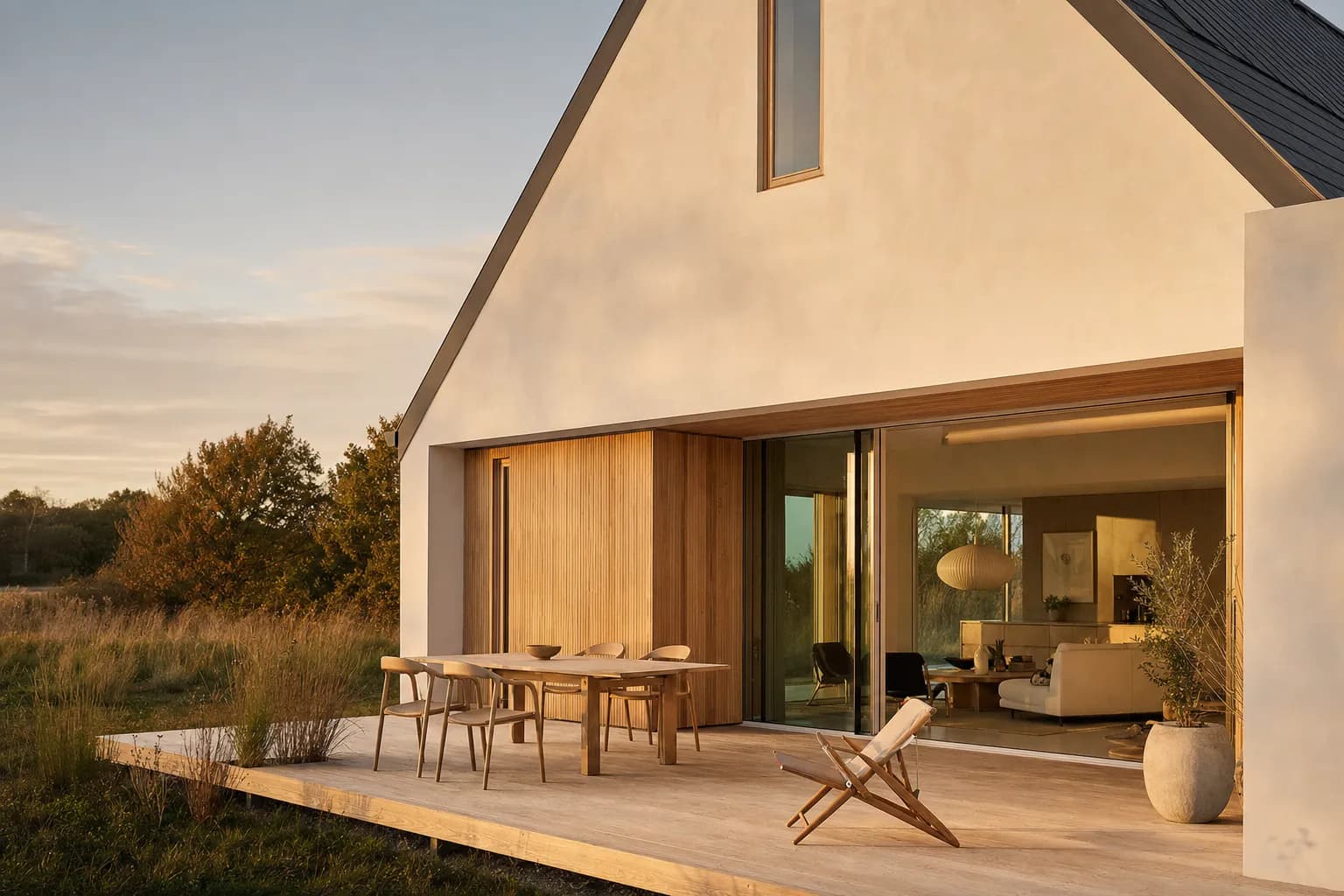
What are architectural rendering styles?
A rendering style is the visual treatment of an architectural image. It controls technique, mood, material expression, and finish without changing the design.
That distinction matters during review. A treatment can make the same massing feel quiet, tactile, clinical, or theatrical. It can direct attention toward form, materials, occupation, or atmosphere. Yet the walls, openings, and camera should remain accountable to the project.
The term often gets stretched too far. Photoreal and watercolor describe technique. Dusk describes mood and light. Interior describes a view type. Nordic describes an architectural language. Those labels can work together, but they answer different questions.
Name the axis before comparing options. Then test one variable at a time. This keeps a style study useful. It also stops a material change from hiding inside a lighting change.
Use 570+ architecture render prompts to see these axes combined in complete briefs.
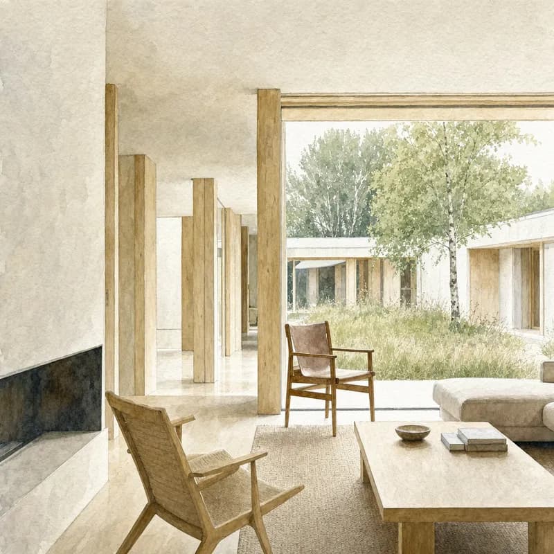
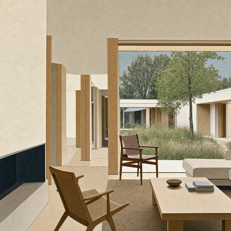
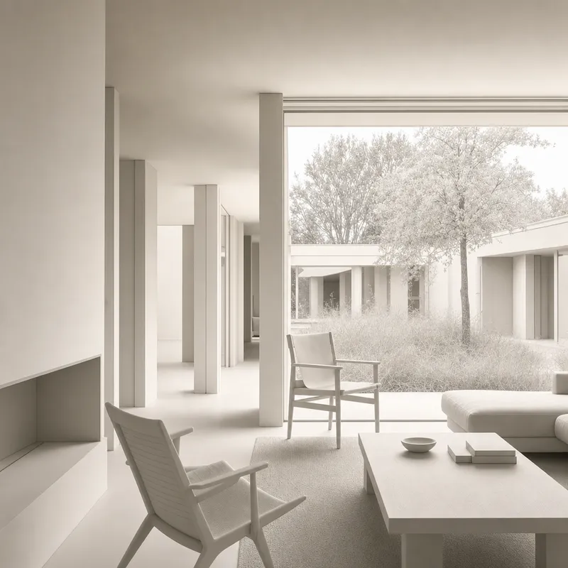
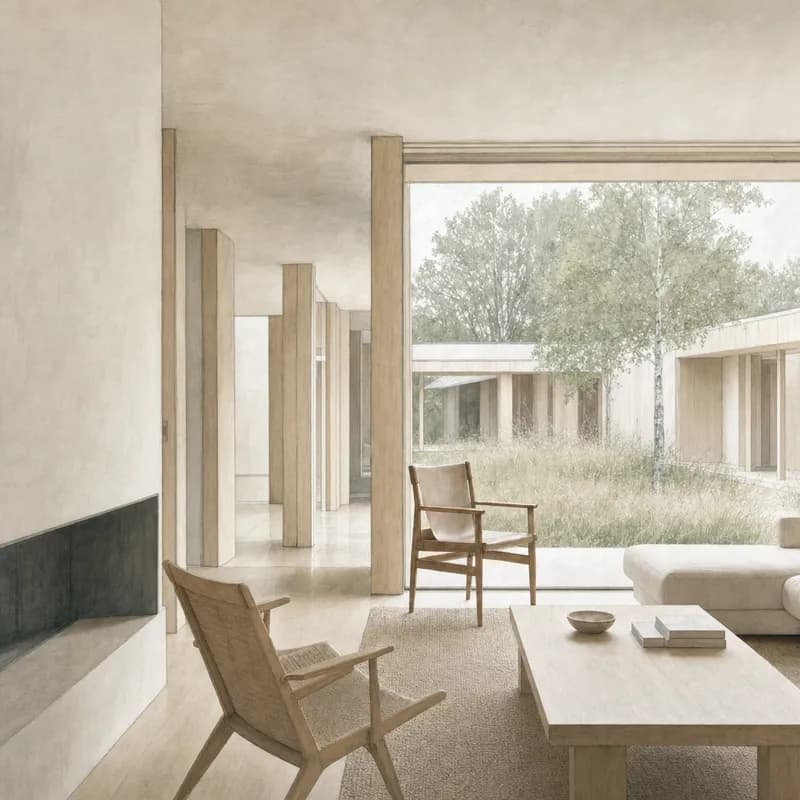
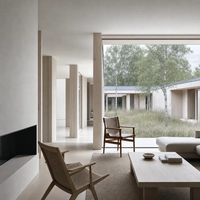
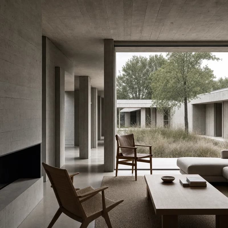
What do 12 rendering styles look like on the same scene?
Twelve rendering styles can make one fixed scene read in distinct ways. The comparison below keeps the camera, geometry, and landscape unchanged.
Only the preset changes. Each option shifts materials, light, and finish. That fixed base makes differences easier to judge. It also exposes presets that conflict with the source design.
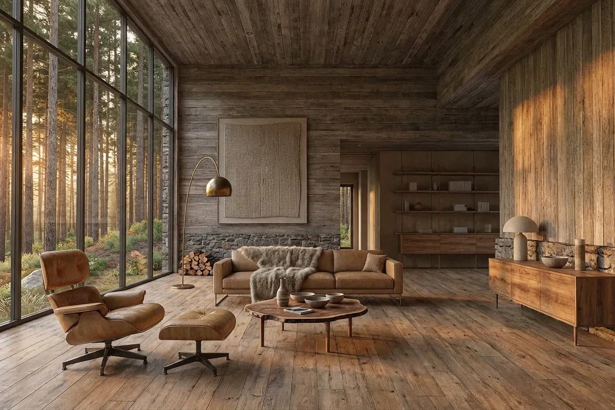 Eco-Lodge
Timber, stone, and soft daylight suit landscape-led retreats and low-impact hospitality.
A preset is a starting direction, not a design correction. Brutalist concrete cannot make light timber geometry inherently Brutalist. Tropical materials do not solve a cold-climate envelope. Review every output against the source geometry, climate, and brief.
The Style Atlas is the canonical reference for preset names, definitions, and direct comparison. Use it to shortlist a direction before building a full image set.

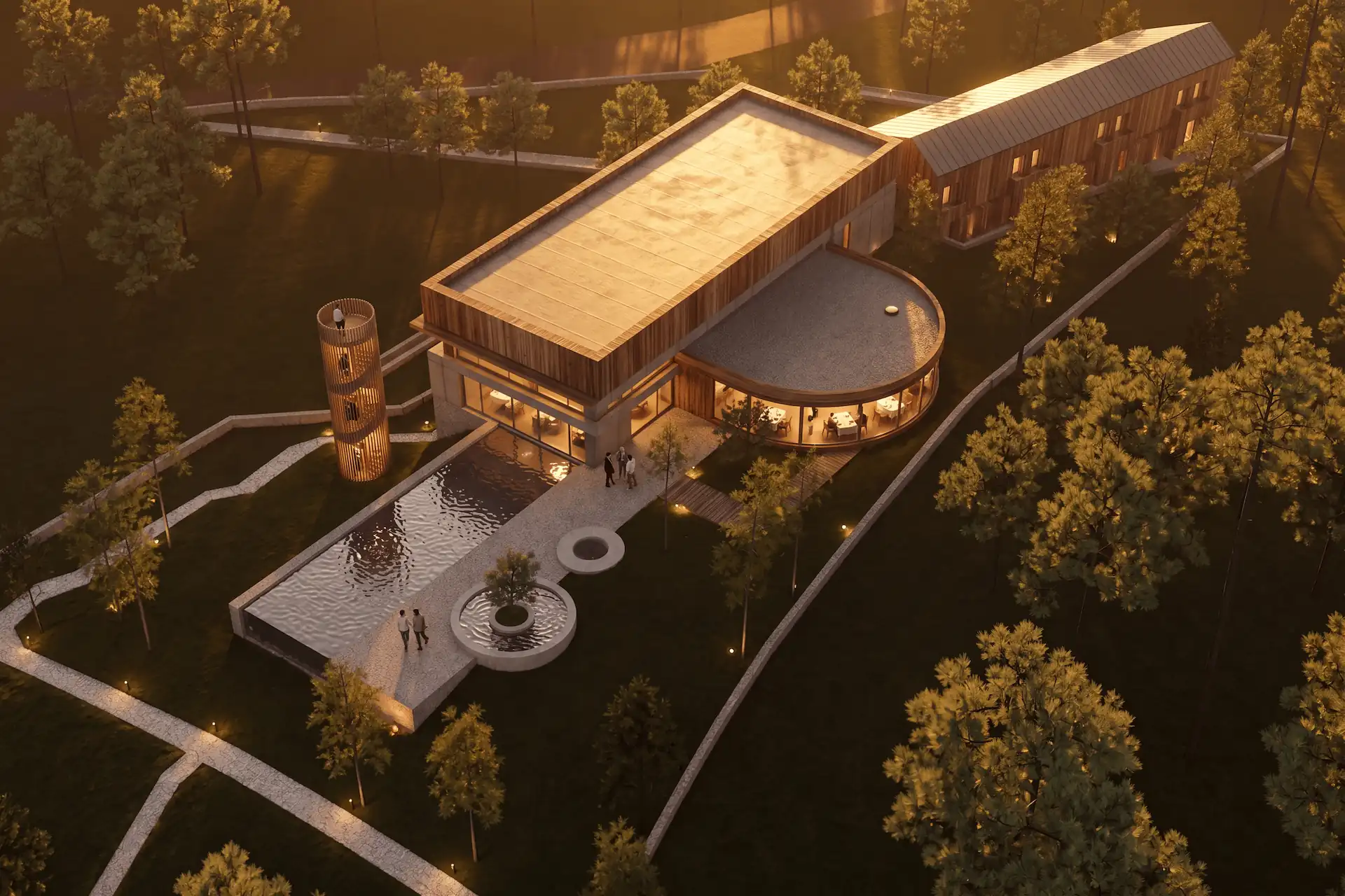
Before / after
Try these presets on your own scene. Start free.
What are the four axes of a rendering style?
Most confusing style lists mix four separate decisions. Name the axis first, then choose within it.
The axes can overlap in one image. A photoreal interior can use Nordic materials and dusk light. A watercolor section can use a muted finish. The labels become useful once each has a clear job.
| Axis | What it changes | Examples |
|---|---|---|
| Technique | How the image is made to read | Photoreal, watercolor, collage, clay |
| Mood and finish | Atmosphere, contrast, and emotional temperature | Soft, dusk, cinematic, muted, crisp |
| View type | Which part or projection is shown | Interior, exterior, section, plan, axonometric |
| Architectural language | Material and formal vocabulary | Nordic, Japandi, Brutalist, Mediterranean |
Technique: how is the image made to read?
Technique controls the image language. Photoreal work simulates a camera. Watercolor uses translucent washes and selective detail. Collage combines textures, cut elements, and graphic fields. Clay suppresses material decisions so massing and shadow lead.
Technique does not define the camera or building type. The same exterior view can support several techniques. See architectural rendering techniques for their uses and limits.
Mood and finish: what atmosphere does the image carry?
Mood and finish control atmosphere and emphasis. Soft, muted, crisp, cinematic, daylight, and dusk can sit over several techniques. A soft photoreal image and soft watercolor differ in technique. Their low contrast can still create a related mood.
Finish also signals certainty. Sharp joints and polished reflections suggest a resolved proposal. Hazy edges and quiet contrast leave more questions open.
View type: what part of the project does the image show?
View type names the content or projection. Interiors, exteriors, sections, elevations, plans, and axonometrics are outputs. They are not styles.
Each view still needs a technique and mood. Sections also need graphic rules for poche, cut lines, and depth. The next section gives the short taxonomy.
Architectural language: what design vocabulary does the image express?
Architectural language belongs to the project first. Nordic, Japandi, Brutalist, and Mediterranean describe material and formal systems. They affect proportion, junctions, openings, and construction logic.
A render should clarify that language. It should not paste a surface package over conflicting geometry. Use a preset as a study, then judge whether the building supports its claims.
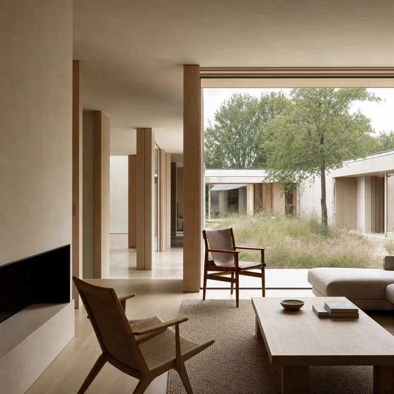
What are the types of architectural rendering at a glance?
Rendering types classify the output, not its visual treatment. Common types include interior and exterior views, sections, elevations, plans, site plans, concept studies, and final photoreal images.
A project often uses several types. An early package might combine a massing axonometric, one exterior, and a diagrammatic section. A later package might add interiors, detailed elevations, and a site view. Each output can then carry its own technique, mood, and architectural language.
The taxonomy helps you commission the right image. It also clarifies what a client or consultant needs to review. It does not decide whether the image should look photoreal, soft, collaged, or cinematic. That is the style layer.
See the full types of architectural rendering taxonomy for definitions, project stages, and examples.
Prompt library · 626 promptsArchitecture render promptsBrowse prompts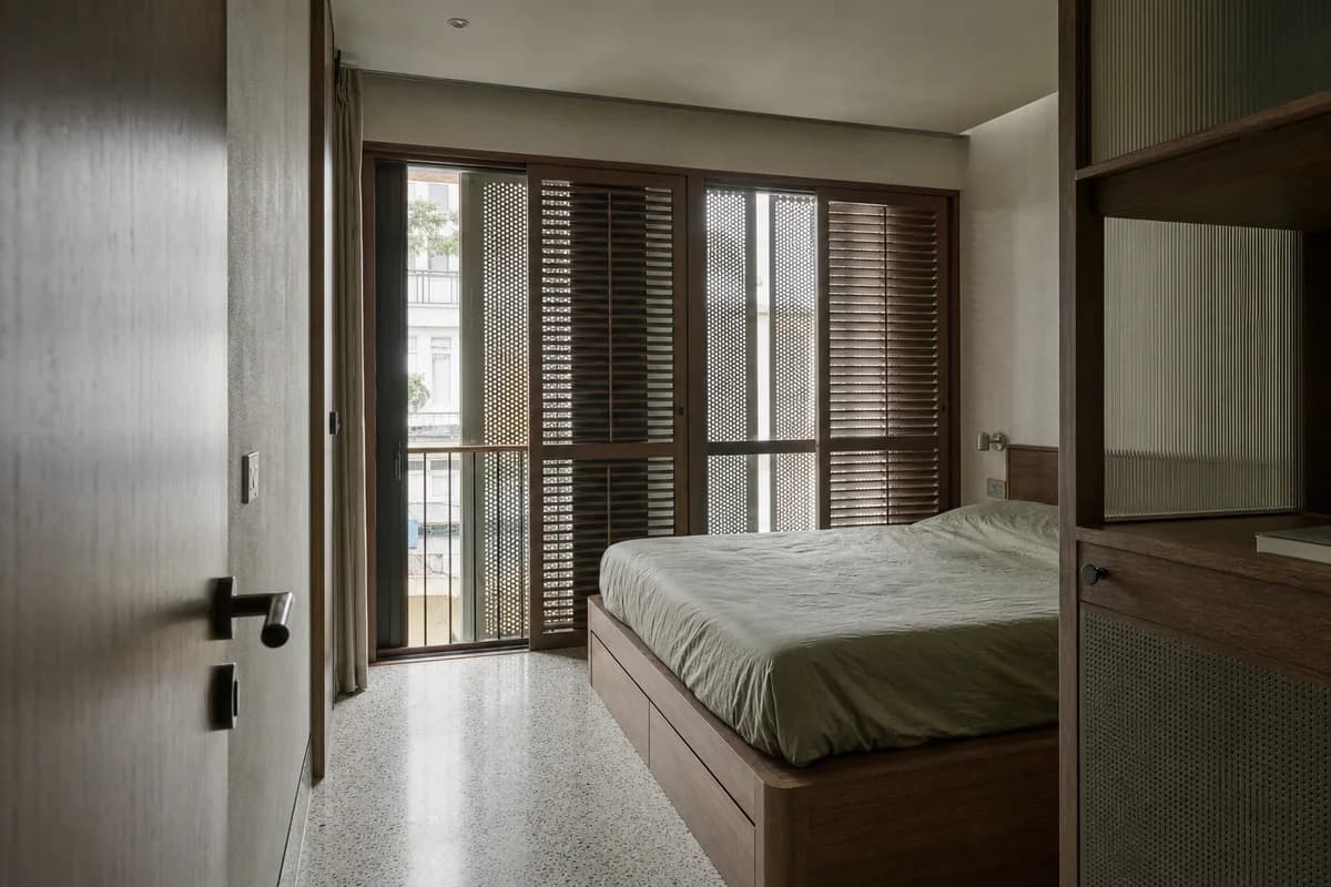
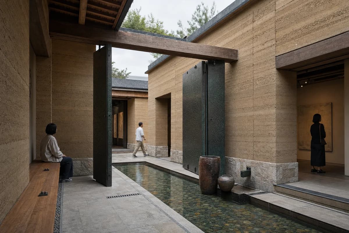
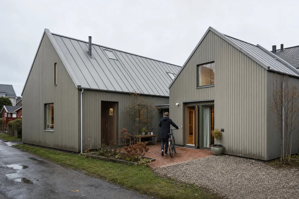
How do you choose a rendering style for the design stage?
Choose the style by the decision the image needs to support. Early studies benefit from restraint, while final review needs clear materials and light.
Audience matters too. A design team may need evidence about massing or facade rhythm. A client may need material clarity and a readable sense of occupation. A competition jury may need one coherent narrative. Do not ask one image to do all three jobs.
| Project need | Useful treatment | Why |
|---|---|---|
| Early massing study | Clay, collage, or soft conceptual | Keeps attention on form and direction |
| Design development | Clear daylight with controlled materials | Supports specific review |
| Material review | Photoreal interior or exterior | Exposes palette and junction issues |
| Client board | Photoreal daylight plus one mood-led hero | Balances evidence and atmosphere |
| Competition image | One deliberate technique and mood | Supports a clear narrative without masking the proposal |
For a jury-facing set, plan architecture competition renders around one board argument. Let each image support a different part of that argument.
For renders for client review, build the set around clear workhorse images. Add a mood-led hero only when it supports the story. The portfolio renders guide applies that hierarchy across a complete body of work. The render entourage guide covers people, planting, vehicles, scale, and density. Use the architecture presentation board guide to set image roles, frames, and reading order. The broader guide to AI architectural rendering covers inputs, review, and iteration across the workflow.
Why is photoreal daylight the dependable default?
Even daylight keeps materials, proportions, and openings legible. It suits working images and most client-facing sets.
Neutral light gives the eye stable evidence. Material color stays easier to compare across revisions. Shadow still explains depth, but it does not dominate the image. Context, glazing, and landscape remain readable.
The word photoreal does not guarantee accuracy. Check facade bays, roof edges, stairs, and furniture scale. Reflections can hide errors. Dense planting can cover unresolved ground conditions. Use realism to inspect the proposal, not to excuse it.
When should you avoid photorealism?
Use photorealism carefully while the design remains unresolved. A finished surface can make an early proposal look fixed. Clients may begin reviewing brick color before the plan works.
A clay, collage, or low-contrast image can hold the right level of uncertainty. These approaches keep attention on form, spatial intent, and broad material direction. The guide to soft and conceptual rendering styles shows when that restraint helps.
Is photorealism a technique or a rendering type?
Photorealism is mainly a technique and finish. It can apply to interiors, exteriors, sections, and other view types. A photoreal interior and photoreal exterior are two outputs using a related image language.
The full architectural rendering techniques guide compares photoreal work with collage, watercolor, clay, and line-led treatments.
How does lighting change the mood of a render?
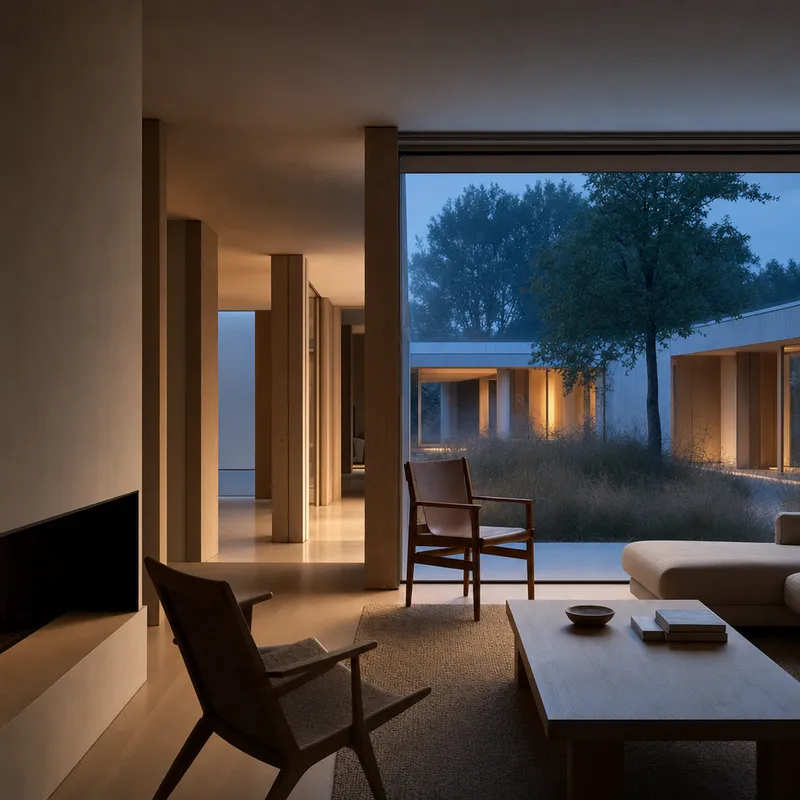
Lighting changes hierarchy, material color, and the sense of occupation. Day, dusk, and night can make the same fixed scene support different review goals. The architectural render lighting guide covers the full comparison and review method.
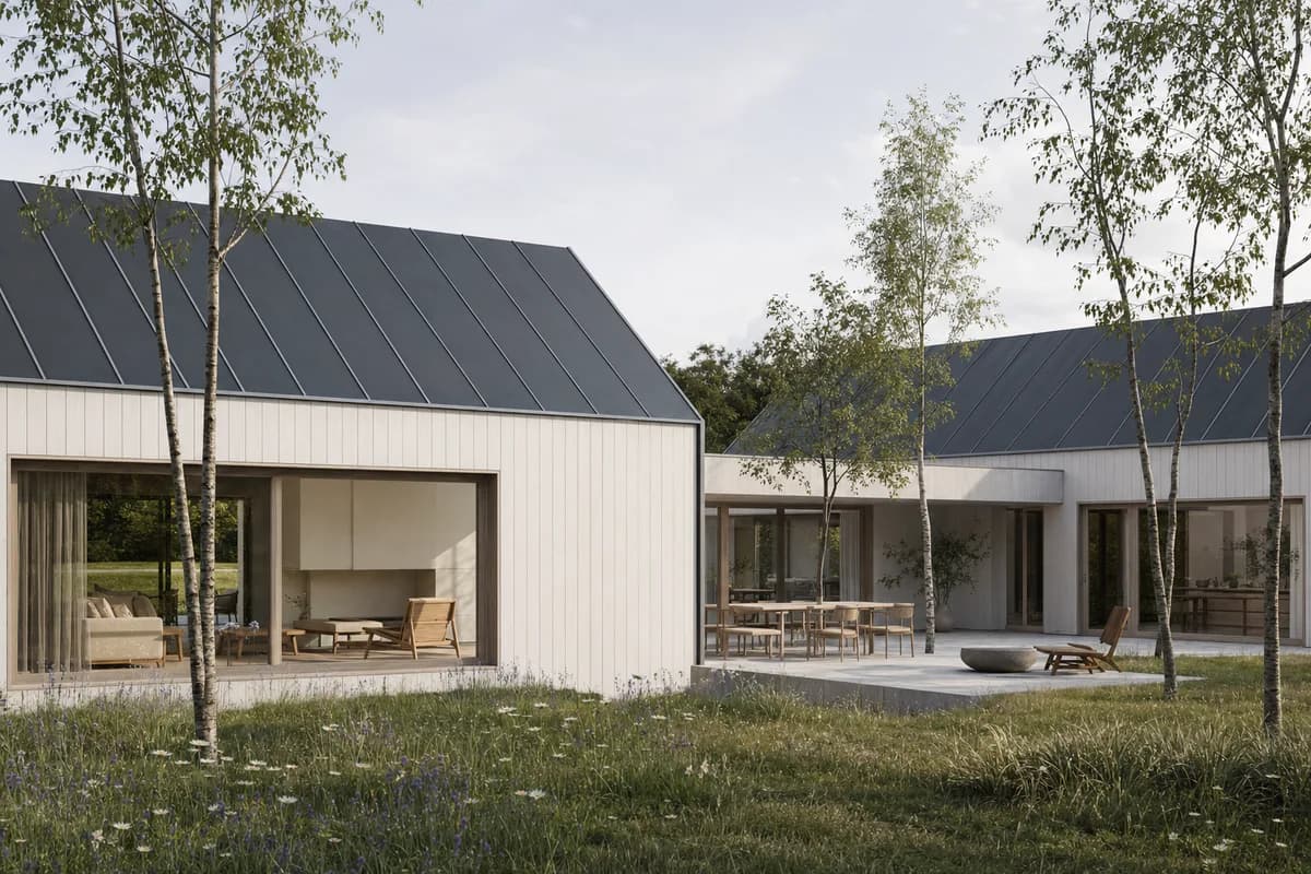 Day
Day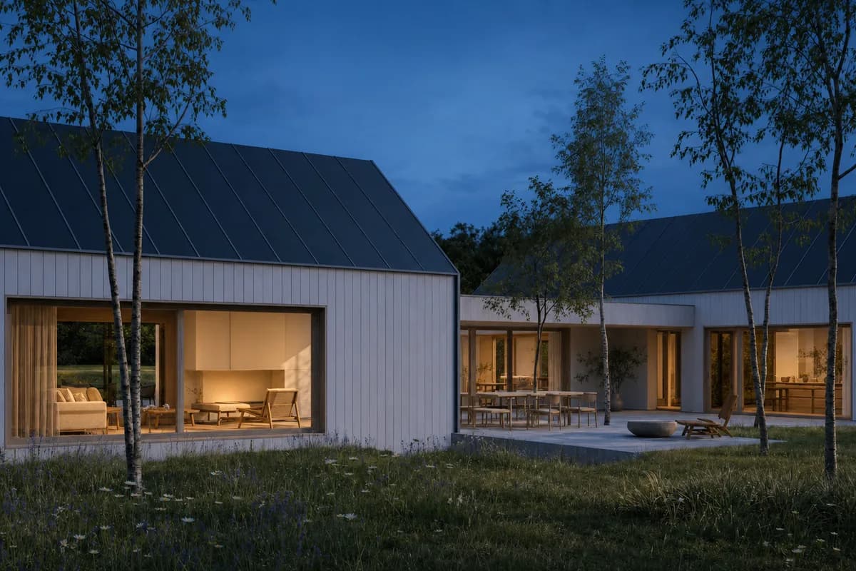
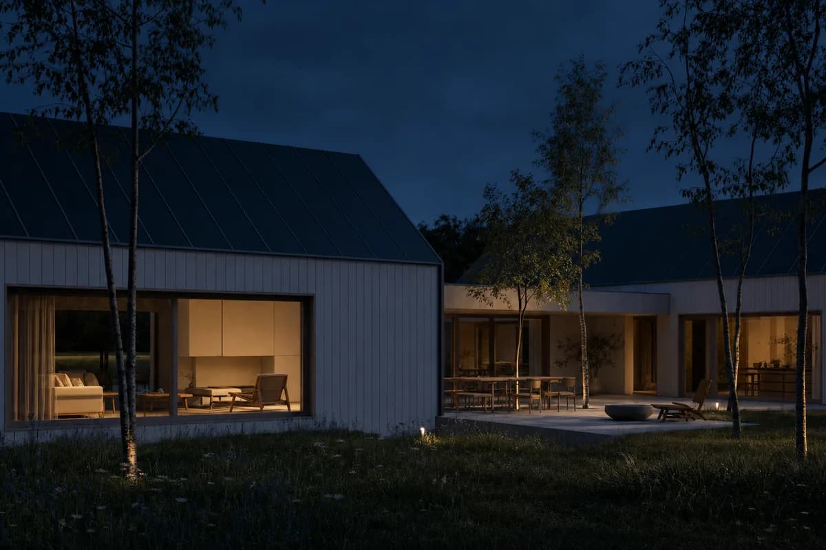
Treat lighting as a project rule. Decide which time supports routine review. Then decide whether one image needs a different mood. A consistent baseline makes revisions easier to compare.
Daylight for evidence
Daylight shows material color, form, context, and shadow depth. It is the workhorse setting for option studies and revision sets. Use a clear sun angle or diffuse overcast light. Keep the exposure stable between views.
Direct noon light can flatten vertical surfaces. Very low sun can create long shadows that obscure entrances or paving. Choose an angle that explains the building.
Dusk for warmth and occupation
Dusk balances a readable exterior with warm internal light. It can show how rooms meet a terrace, street, or garden. It also gives one key view a stronger role on a board.
Keep the facade visible. A black silhouette with glowing windows reveals little about materials. Use dusk for one or two key views. Let daylight carry the evidence elsewhere.
Night for a focused lighting story
Night shows internal occupation and facade lighting. It suits hospitality, cultural, and public projects where lighting forms part of the design.
Material color becomes less reliable after dark. Reflections and deep shadows can hide junctions. Pair a night view with daylight. The pair shows both the lighting intent and the underlying architecture.
What makes a soft or conceptual rendering style useful?
Soft and conceptual styles keep unresolved work visibly open. They direct attention toward intent instead of simulated completion.
Clay suppresses material choices and clarifies massing. Watercolor allows selective emphasis through washes and line. Collage can test occupation, landscape, and atmosphere without imitating a camera. Low-contrast photoreal work can also feel conceptual through muted light and restrained detail.
Technique and mood remain separate. Watercolor is a technique. Softness is a finish. A collage can be bright and graphic, while a photoreal image can remain quiet and tentative.
Use these treatments for massing reviews, competition studies, and early client conversations. They are not incomplete photoreal images. They are deliberate review tools. See soft and conceptual rendering styles for examples and selection guidance.
How do view type and architectural language affect the look?
View type decides what the image must explain. Architectural language decides which material and formal vocabulary the image should express.
Confusing them produces weak briefs. “Nordic interior” combines an architectural language with a view type. It still needs a technique, mood, and lighting rule.
Interior and exterior are view types
Interiors prioritize material junctions, furniture, human scale, and controlled light. They need believable floor textures, window exposure, and object scale. Exteriors prioritize massing, facade rhythm, context, weather, and ground conditions.
Both views can use Nordic, Brutalist, or Mediterranean language. Both can use photoreal or conceptual techniques. The guide to interior rendering styles compares those choices inside the room. The interior rendering with AI guide covers the practical model-to-image workflow.
Sections and elevations need their own graphic hierarchy
Sections and elevations rely on cut lines, poche, depth, and entourage. Their hierarchy should survive any added material or atmosphere. Keep cut elements clear and distant context quiet. See architectural section rendering styles for dedicated examples.
Nordic, Japandi, and Brutalist are architectural languages
These labels govern material and formal choices. Nordic work often uses pale timber, controlled openings, and quiet daylight. Japandi adds tactile restraint and low furniture. Brutalist work depends on mass, concrete, deep reveals, and structural clarity.
They can appear in interiors, exteriors, sections, daylight, or dusk. The render must stay faithful to the design. If a language needs new openings, roof forms, or structural spans, return to the model first.
How do you match a rendering style from a reference photo?
Use the reference to guide light, palette, material character, and finish. Keep the project geometry as the source of truth.
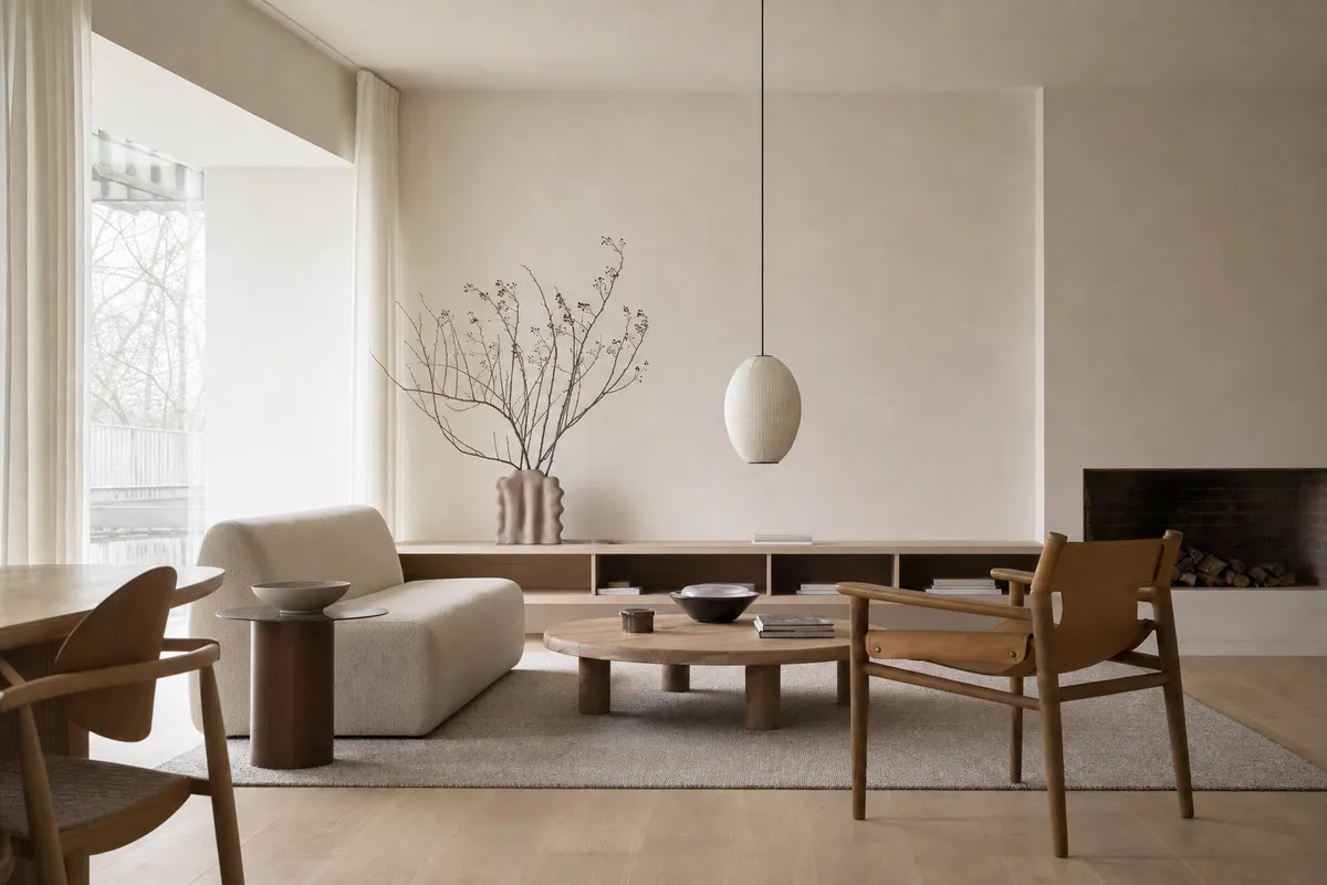 Reference
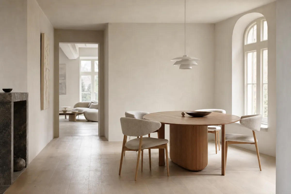 Project room
Read a reference in layers. Start with light direction and softness. Then note the palette, material roughness, contrast, camera height, and degree of detail. Do not ask the project to copy furniture placement or room geometry.
The source and result above use different rooms on purpose. The match concerns visual treatment, not plan or form. After approval, save the result as a preset in CAD Scene. That preset can guide later views.
Follow the full workflow to match a rendering style from a photo. Test the preset on an interior and exterior before applying it across the project.
How do you keep one look across a full project?
Keep one look by fixing the palette, lighting rule, and approved preset. Review every image together, then correct the outlier.
Consistency does not mean identical exposure everywhere. Interiors and exteriors need different camera responses. The shared system should still be clear. Timber tone, wall color, contrast, sky behavior, and entourage should feel related.
Fix the project palette
Record the approved material colors, texture character, and important junctions.Choose a lighting rule
Use one daylight direction and exposure logic for the workhorse views.Save the preset
Store the approved treatment as a preset with a clear project and review name.Apply it across view types
Use the preset on interiors, exteriors, and details without changing the design.Review the set together
Compare every image at board scale and correct the visual outlier.
Create a new preset version when the approved direction changes. Do not overwrite the earlier review state. That older version records what the client or team approved at the time.
For renders for client review, keep the workhorse views calm. Reserve dusk or another mood-led treatment for the image that needs it. A set reads clearly when each image has a defined role.
FAQ
These answers separate visual treatment from output type. They also cover selection, consistency, and reference matching.
What are the main architectural rendering styles?
Common visual treatments include photoreal, watercolor, collage, clay, soft conceptual, daylight, dusk, and cinematic finishes. Architectural languages such as Nordic and Brutalist add another axis.
What is the difference between a rendering style and a rendering type?
A style describes how an image looks. A type describes the output, such as an interior, exterior, section, elevation, or plan render.
Which architectural rendering style is best for client review?
Photoreal daylight is a dependable base because materials and proportions stay legible. Add one dusk image when the set needs a warmer hero view.
How do I keep one rendering style across a project?
Fix the palette and lighting rule. Save the approved treatment as a preset, then review every image together.
Can I match the look of a reference photo?
Yes. Use the reference to guide light, palette, and finish while keeping your project geometry as the source of truth.